12 Years of Gmail, Part 4: Chat
Posted on 18 November 2016 in Technology
This post is part of my series, 12 Years of Gmail, taking a look at the data Google has accumulated on me over the past 12 years of using various Google services and documenting the learning experience developing an open source Python project (Takeout Inspector) to analyze that data.
With the Finishing Touches in place, it's finally time to start looking at some of the data in my Google Takeout Mail export file. What better to start with than the Google Talk (or Google Chat, as I will refer to it) content stored within!
I am starting with Chat because I was surprised to find it all stored in the export file. It makes sense as chat history is accessible from the Chats link in the old Gmail interface (I couldn't find an equivalent in Inbox). My surprise led to curiosity and my curiosity led to obsession with trying to figure how the Chat data is stored and what information each messages contains. It turns out there are quite a few things that can be gleaned from these chat messages -
- Chat vs. Email Usage
- Chat vs. Email Usage (Cumulative)
- Top 10 Chatters
- Chat Clients
- Chat Times
- Chat (vs. Email) Days
- Chat Durations
- Chat Thread Sizes
Chat vs. Email Usage
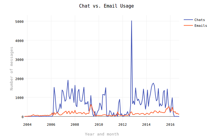
This is the first graph I hacked away at and luckily it provides a neat little anomaly to look at. Undoubtedly the first thing most people will notice looking at this graph is the big spike in Chat activity that occurs in 2012. Zooming in on this (click and drag in the graph) reveals that the spike occurred in October 2012. One other event that may be noticeable (if much less so) is the dip in activity around May to August 2009. What is the relevance of these dates? Two very important events in my life:
- On 12 June 2009, my plane touched down in Burkina Faso and I began my
initial two years of service in Peace Corps Burkina Faso. Internet service
in Burkina was rare and unreliable. Most of the time we had to use the
Basic HTML version of Gmail without Chat support.
- The big dip in August 2010 was the result of a prolonged outage of the Internet service in the town I lived in at the time (Yako).
- The jump in activity in September & October 2011 represents my one trip back home before returning to Burkina for a third year.
- On 10 October 2012, after returning from a little over three years of service in Burkina, I moved to Washington, D.C. to start a new job. The huge jump in Chat activity is a result of the fact that I was separated from my future wife before she was able to move to D.C. in late October.
According to Wikipedia, Google Talk was first introduced in August 2005. Apparently I did not start using it until February 2006. But it certainly took over my inbox...
Chat vs. Email Usage (Cumulative)
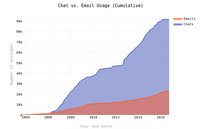
In a mere three months (by May 2006), the number of Chat messages overtook more than three years of email messages stored in my Gmail account. From there Chat continued to grow at a much faster pace than email (outside of the relative flat line while I was in Burkina). This is not particularly surprising given the nature of instant messaging and email, but the volume of Chat messages over emails is much, much higher than I thought it would be.
I only have one small aside regarding the code here - I wanted to build these graphs using a single query and sqlite made that simple with the strftime function and CASE expression (which for some reason does not have an anchor in the sqlite documentation). This query is what is used for both graphs:
0 1 2 3 4 5 6 7 8 9 | SELECT strftime('%Y-%m', `date`) as period, COUNT( CASE WHEN gmail_labels LIKE '%Chat%' THEN 1 ELSE NULL END ) AS chat_messages, COUNT( CASE WHEN gmail_labels NOT LIKE '%Chat%' THEN 1 ELSE NULL END ) AS email_messages FROM messages GROUP BY period ORDER BY period ASC; |
Top 10 Chatters
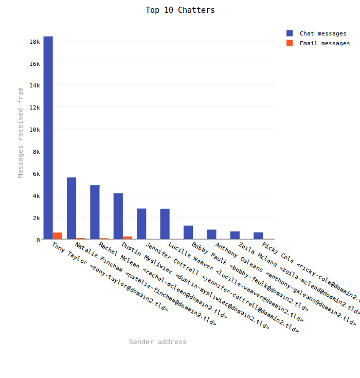
This graph did not turn out particularly interesting for me given the exponential difference between Chat and email messages. It does clearly illustrate that I chatted with my wife (Tony Taylor) a lot. The roughly 18k Chat messages is about 20% of the total Chat messages in my mail file!
Sizing was a bit of a challenge with this graph. As with my previous efforts, the code determines the longest address (by character count) in the result set and attempts to adjust the graph to compensate, like so:
0 1 2 3 4 | layout = self._default_layout_options() layout['barmode'] = 'grouped' layout['height'] = longest_address * 15 layout['margin']['b'] = longest_address * self.config.getfloat('font', 'size') / 2 layout['margin'] = go.Margin(**layout['margin']) |
Once again, I guess-and-checked my way to some seemingly random numbers that appear to have the desired effect regardless of font size. Line 2 sets the overall height for the graph and Line 3 adds a bottom margin to (theoretically) fit all the addresses. Previously I did not change the overall size of the graph and this can still result in squished graphs on smaller screens.
Chat Clients
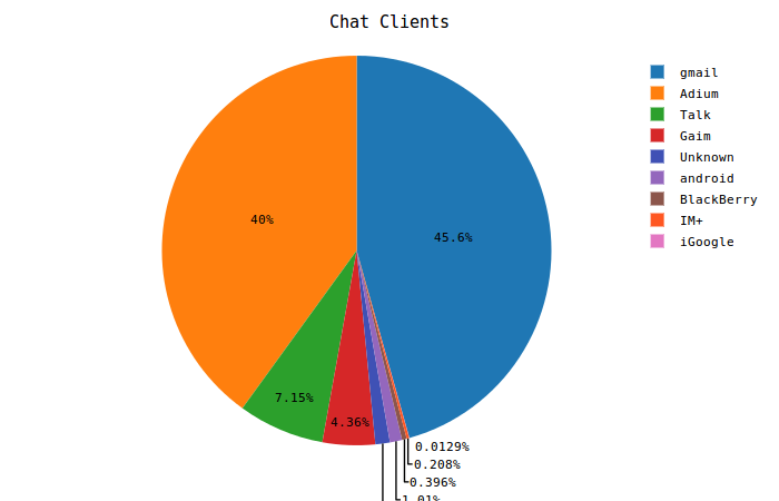
This was a fun one to do because it is a sort of non-obvious way to look at the metadata in each Chat message. I learned about the Resourcepart used by XMPP while I was sorting out how to parse email addresses. At the time my only goal was to get rid of it in order to clean up the email addresses. The data that ultimately ends up in sqlite does not include the Resourcepart except in the headers table, which holds row-by-row records of every raw header from all messages.
Because the standard is apparently not well followed by instant messaging clients, the aggregate information here is really just a best guess. I knew of most of the clients, but also found some others through an old blog post from Google, Third Party Client Use of the Google Talk Service, covering their own investigation of third party clients using the (relatively newly launched) service. I'm sure some are still missing.
As for my own chart, I was a big fan of Adium back when I used instant messaging much more frequently - that's about the only revelation here.
Chat Times
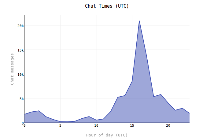
This is a simple view of the hours of the day when I do the most chatting. The graph times are UTC and for the majority of the messages I was likely in the Central or Eastern timezone (UTC−6) or (UTC-5) so it appears that I did most of my chatting in the morning hours.
The one thing I remember about working on this graph is this long line of code for calculating the percentages:
0 1 | for hour in data.keys(): percentages[hour] = str(round(float(data[hour])/float(total_messages) * 100, 2)) + '%' |
I suspect there is a more elegant way to arrive at the same result so I will have to revisit that graph method in the future. Having to deal with types when combining variables is not an issue in PHP and it is taking me a while to wrap my brain around this in Python. I encounter lots of TypeError exceptions!
0 1 | print 10 + '%' TypeError: unsupported operand type(s) for +: 'int' and 'str' |
Chat Days
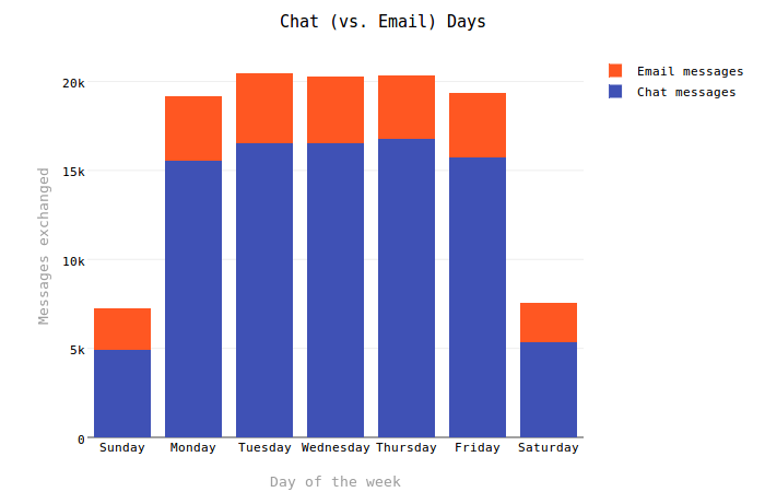
This graph turned out just about as I expected it - I tended to use Chat as a means of communication with friends while at work during the weekdays (so this comports with the Chat Times graph above (and perhaps there is some combined view to consider here...)). Chat conversation dominated about 80% of my communications during the week, but dropped closer to 70% on the weekends as I would generally have more time to compose emails. I suspect that my earlier habits also influence this relationship - nowadays I am more inclined to spend weekends doing other things.
This is another place where I feel there could be a lot done to clean up the code:
0 1 2 3 4 5 6 7 8 9 | chat_percentages = OrderedDict() chat_messages = OrderedDict() email_percentages = OrderedDict() email_messages = OrderedDict() for row in c.fetchall(): dow = calendar.day_name[int(row[0]) - 1] # sqlite strftime() uses 0 = SUNDAY. chat_percentages[dow] = str(round(float(row[1]) / sum([row[1], row[2]]) * 100, 2)) + '%' email_percentages[dow] = str(round(float(row[2]) / sum([row[1], row[2]]) * 100, 2)) + '%' chat_messages[dow] = row[1] email_messages[dow] = row[2] |
This seems like a lot of work to make pretty simple calculations. I would also like to cut down on the number of dictionaries, if only to make the code read a little bit easier. Currently the up-side is that this setup makes it dead simple to craft the graph building statements.
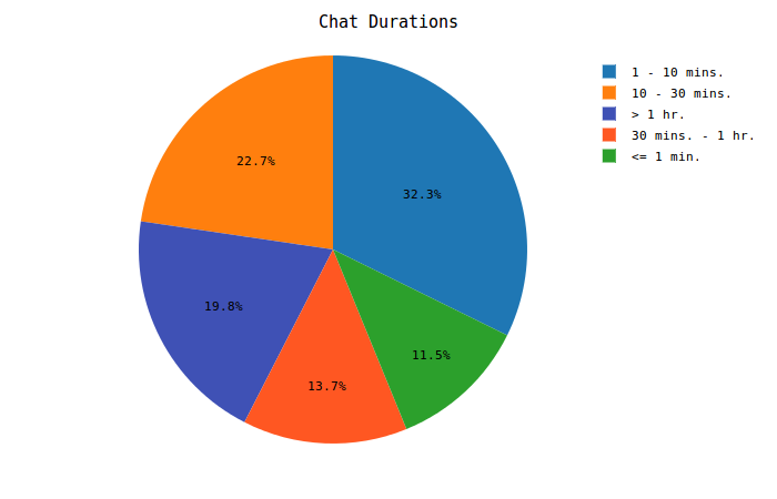
Chat Durations
This was a particularly interesting graph to work out due to the way that Chat messages are stored in the Mail file. An example message entry for Google Chat content looks like this:
From 1234567890123456789@xxx Sun Oct 04 11:20:57 +0000 2015
X-GM-THRID: 1234567890123456789
X-Gmail-Labels: Chat
MIME-Version: 1.0
From: Bob Thompson <bob-thompson@domain2.tld>
Content-Type: text/html

Hello!
Notice anything missing there? There is no To or Date header! Luckily, the date is available on the From line and its position and format is consistent for all messages - it is always the last 30 characters in the string so string[-30:] captures the date and time easily. But how can this be used to figure our chat durations? In combination with the X-GM-THRID header!
The Thread ID connects multiple messages together in to threads, which helps to string together messages and find things like durations and participants (remember that missing To header?). Takeout Inspector handles these dates during the import process and also brings in each message's Thread ID in the messages table. With these data points, the following query will produce chat durations:
0 1 2 3 4 | SELECT strftime('%s', MAX(`date`)) - strftime('%s', MIN(`date`)) AS duration FROM messages WHERE gmail_labels LIKE '%Chat%' GROUP BY gmail_thread_id HAVING duration > 0; |
Pretty simple really. Unfortunately, some messages have the exact same time for the entire thread so these end up with a duration of zero. I have not been able to find any common factor that indicates why this happens. Single message threads also come up zero and originally these results were included and categorized as "Unknown". In my case this accounted for almost 20% of all my Chat messages so I elected to add Line 4 above to exclude those results from the set (see commit #4739987).
Chat Thread Sizes
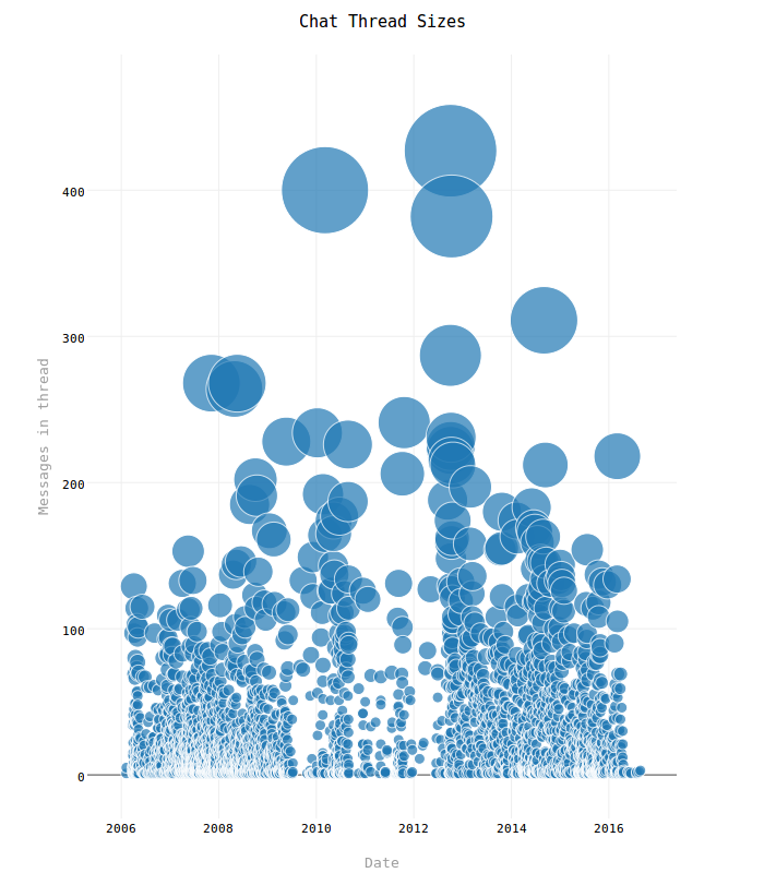
Here again is the very distinct drop in activity lining up with what appears in the Chat vs. Email Usage graph above. I don't think this graph is particularly good (for my mail file) given how clustered up everything is, but it does do a further job of illustrating that down time and it's at least somewhat interesting to see the "waterfall" effect from larger to smaller threads.
This graph is largely just an attempt to get away from the typical set of line, bar, pie etc graphs. The size of each circle represents the number of messages in the Chat thread (bigger circle == more messages). Hover over any individual circle to also see:
- Message count
- Thread date
- Thread participants
All of these data points are retrieved with the following query:
0 1 2 3 4 5 6 | SELECT gmail_thread_id, strftime('%Y-%m-%d', `date`) AS thread_date, COUNT(message_key) as thread_size, GROUP_CONCAT(DISTINCT `from`) AS participants FROM messages WHERE gmail_labels LIKE '%Chat%' GROUP BY gmail_thread_id; |
Line 3 is the important bit - it uses the GROUP_CONCAT() function to pull in all the participants that it can find for each thread. Group chats unfortunately use special addresses that identify the group as a whole. These is actually a unique identifer for each participant included in the address, but there is no way to determine who the participant is beyond the random string of characters assigned. Currently this convention is ignored so groups just show up as a single participant in this graph.